 commonsymbols.com
Print Conventions
Apply scale, spacing, and hierarchy rules that balance visual clarity, physical constraints, and reading distance for printed artifacts.
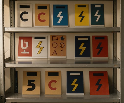
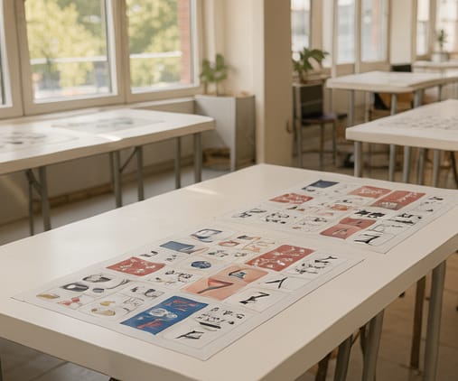
Scale symbols by reading distance: use larger sizes for posters viewed from afar, medium for manuals held at arm’s length, and smaller for tightly packed UI mockups or footnotes. Maintain at least one symbol width of padding around each icon to avoid visual crowding and preserve readability in dense layouts. Print resolution affects legibility—ensure minimum stroke weight and radius values exceed 0.25pt at final output size to prevent feathering or loss of detail during repro.
Use consistent kerning between symbol and adjacent text—typically 0.2 to 0.3 times the symbol’s x-height—to reinforce association without merging characters. In manuals, group symbols with callouts using a clear type hierarchy: bold label, then italic context, then the icon at standard size. Avoid aligning symbols to text baselines; center them vertically on the x-height line instead, especially for symbols with non-linear proportions like arrows or circles.
For multi-page documents, maintain symbol continuity by using identical variants across chapters—same stroke weight, corner radius, and fill color—to prevent misrecognition. In posters or infographics, create visual tiers: primary icons should be 20–30% larger than secondary ones, with 1.5x spacing between tiers. Reserve color-only cues for high-contrast sections; rely on shape, weight, or internal patterns for grayscale fidelity and photocopier compatibility.