 commonsymbols.com
Accessibility Icons
Symbols aligned with WCAG contrast and cognitive load standards, annotated with semantic alternatives.
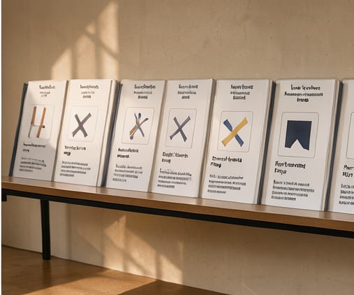
Accessibility Icons are designed to meet or exceed WCAG 2.1 AA contrast requirements for both normal and large text, using measured luminance values in our review process. We also ensure glyphs avoid overloading visual memory by reducing decorative flourishes, relying instead on intuitive forms and spacing to signal meaning at a glance.
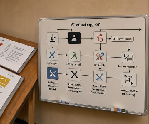
Each symbol in this set includes standardized semantic annotations such as aria-labels, role attributes, and alt text suggestions. These annotations are validated against screen reader output across popular platforms, ensuring that non-visual interactions remain as precise as visual ones. Teams can apply these consistently without redefining semantics per project.
Cognitive load is minimized through reduced visual noise and consistent internal negative space. We avoid relying on color alone to convey meaning, and all glyphs support grayscale reproduction. This allows implementation in both high-contrast and low-vision contexts without requiring alternate assets.